YELLOWPAGES
Search Results
Objective
Traffic dropped consistently over the previous year. The project goal was to adjust results listings page in an effort to increase engagement and overall traffic.
Key Stats
Traffic
80M visits/month
Role
Primary designer (UX and UI)
Approach
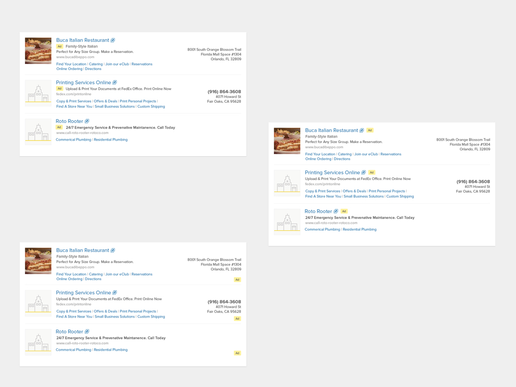
New design released to 20% of traffic in 3 geos. Review metrics and iterate. Iterations were tested using 3 test buckets and 1 control bucket.
Results
The bold phone numbers worked well, too well. Our clicks were reduced and our bounce rate increased. The hypothesis was that our users immediately found what they needed and did not need to click through to the business detail page.
The “Ad” pill at the bottom right corner produced the best results. Shortly after the test we applied this design to 100% of traffic.


